Design System #3: Modernizing a Dated Design System
Fitbit, B2C, Mobile
Background
Fitbit's design team needed both a system and a refresh. We migrated components to Figma and modernized the visual language simultaneously, turning a tooling transition into a design uplift.
Scope
Technological Transition/Migration
Documentation
2019 - 2020 - DS Team
Eric Piers, Design Lead
Ben Wong, Sr Designer
Fitbit’s Challenge
Fitbit's design system was carrying the weight of its startup years: legacy components, outdated design decisions, and tech debt that needed a structured plan to resolve.
The Results & Internal Impact
Faster mockups, clearer component guidance, and stronger engineering alignment, with a visual rollout plan established and legacy debt addressed ahead of the Google acquisition.
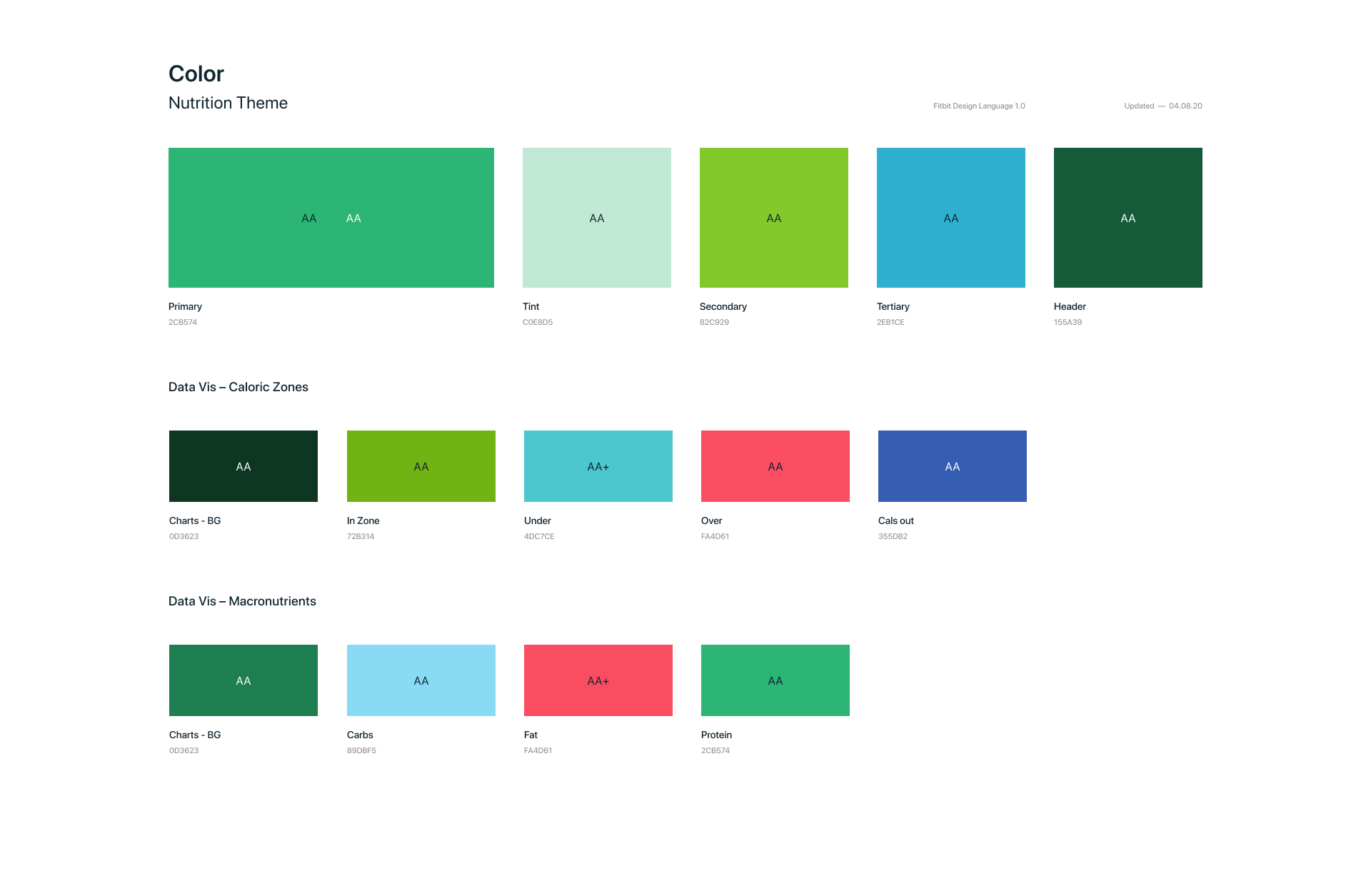
An atomic approach grounded the system in the basics first: typography, iconography, and color as the building blocks. Fitbit's experience leaned heavily on illustration, making color especially critical. It was the primary differentiator across distinct parts of the product experience.
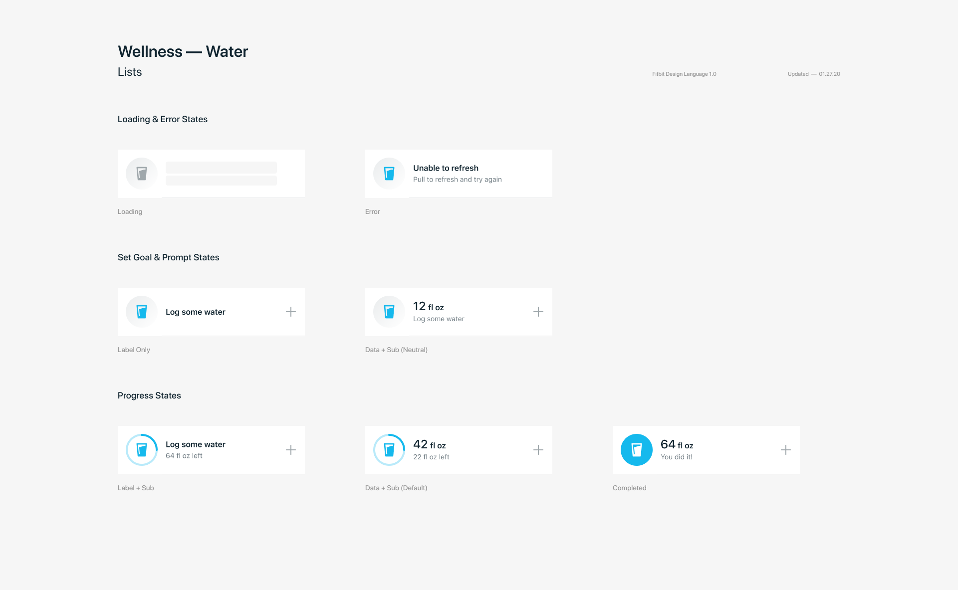
Setting up a strong foundation intentionally helped us tackle more and more complex and high frequency components like the rows shown here.
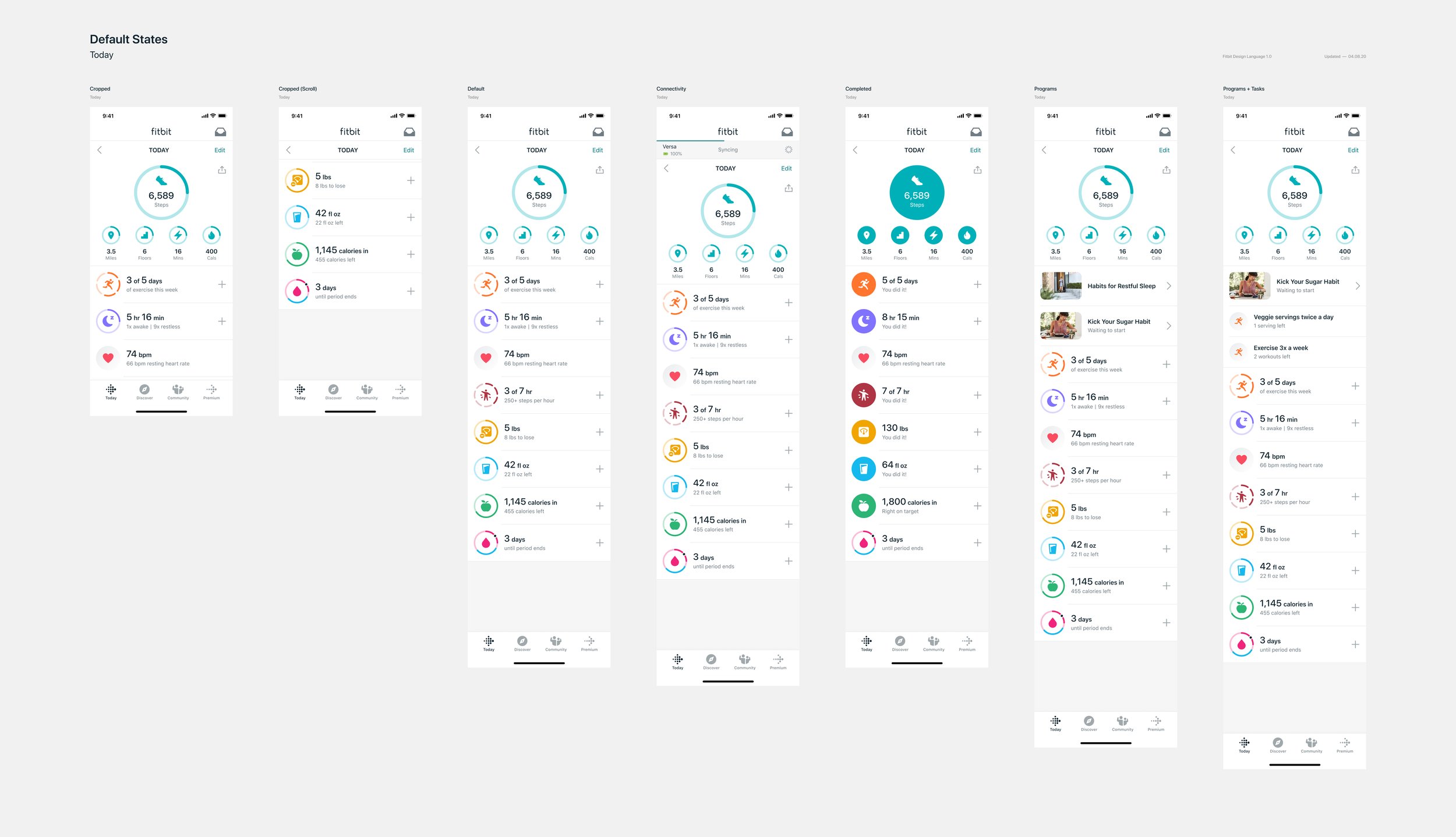
Rather than leaving UX designers to assemble components from scratch, and thereby introducing inconsistencies along the way, we built full templates as components. A complete starting point they could break apart and adapt with confidence.
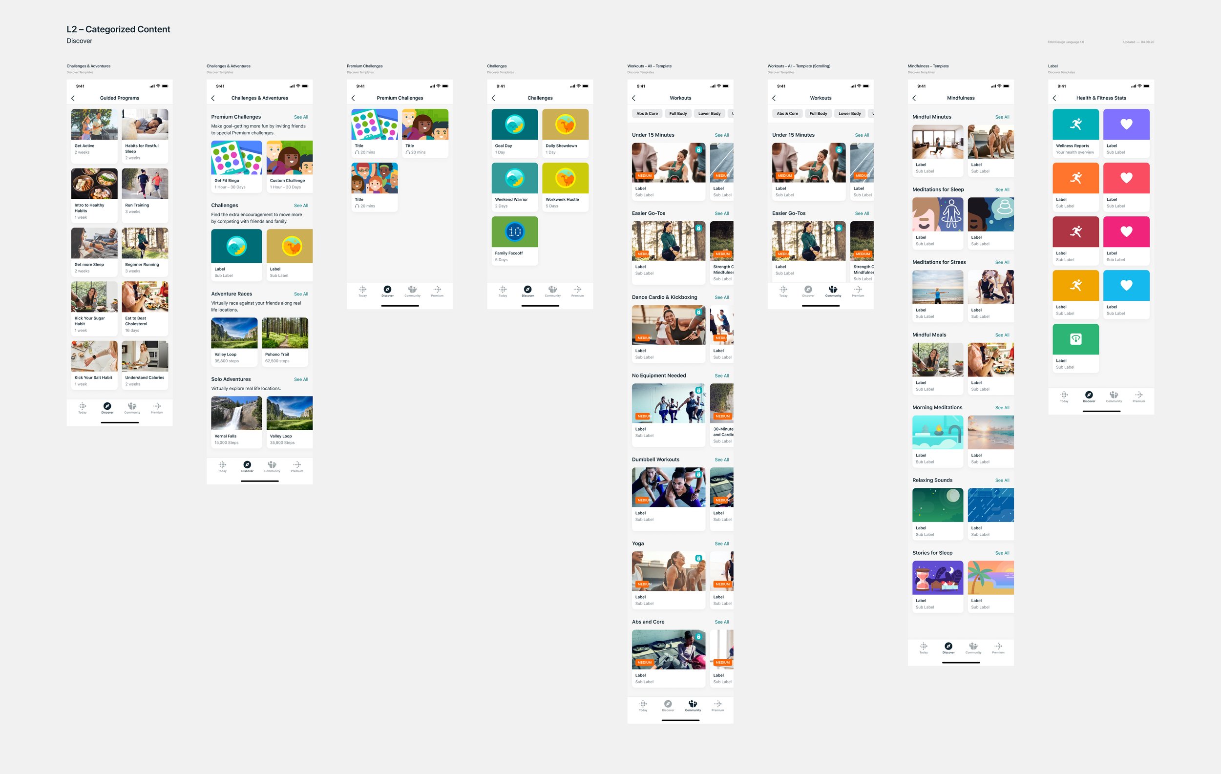
Template variations that establish content patterns and reinforce a sense of place within the app.
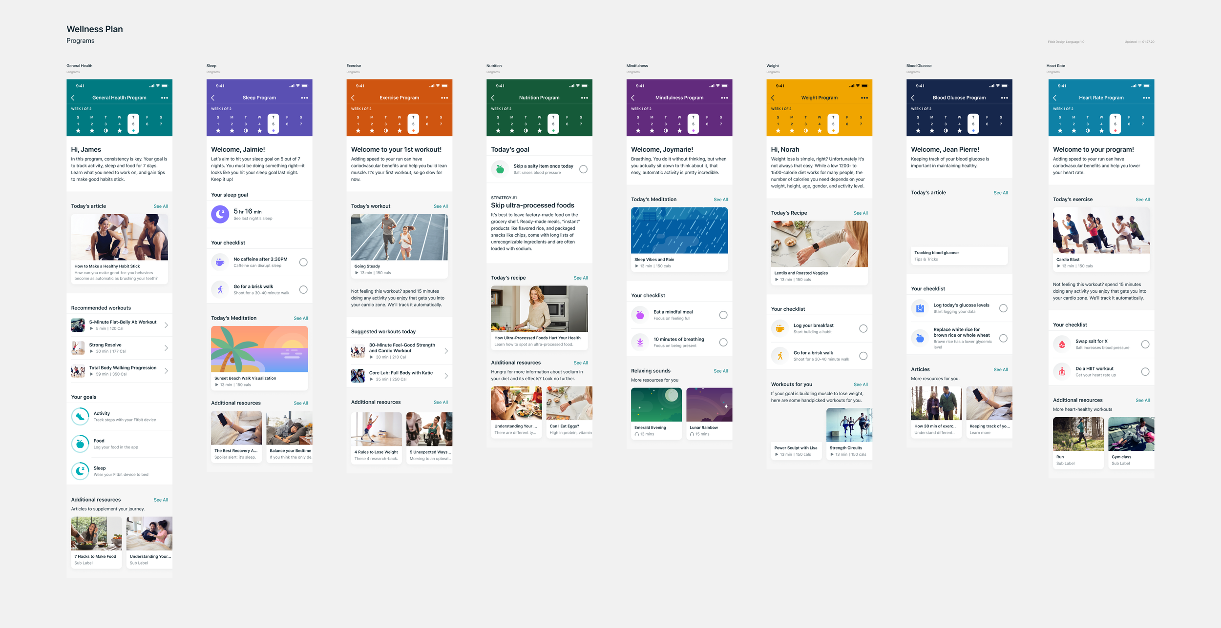
Beyond visual consistency, color theming carried accessibility considerations throughout, ensuring that the same color applied to an icon versus a background met contrast requirements. Every component, from icons to UI elements, was considered in context.
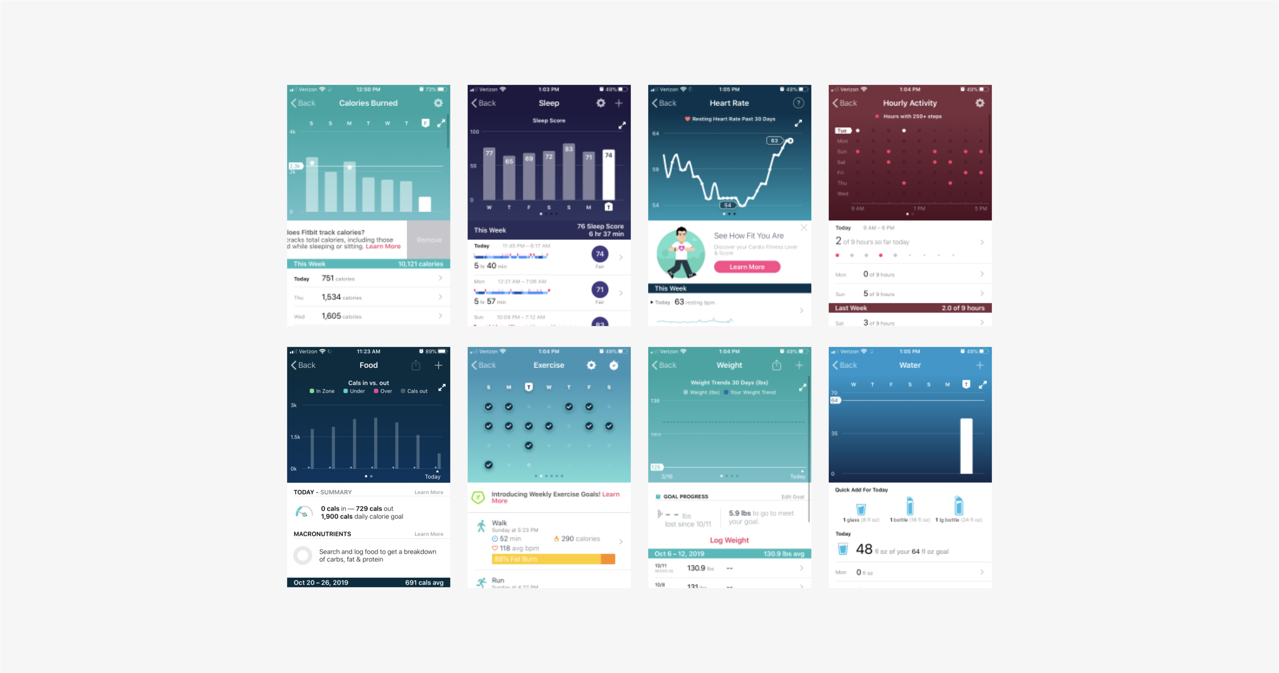
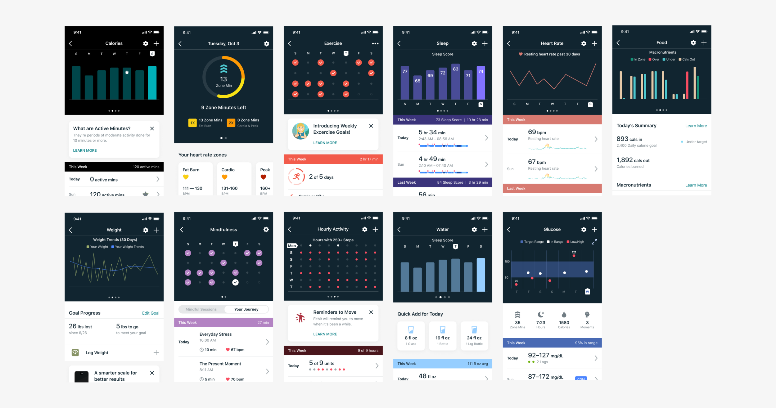
A Before & After that proved the design system could unify graphical parts of the app for a polished and cohesive look.
Final Reflections
Fitbit raised my craft. Working alongside a team with exceptionally high design standards pushed me to operate at a finer level of detail than I had before. Overhauling the legacy system and elevating the product visually was meaningful work.
In hindsight, earlier and deeper collaboration would have made the system stronger. Bringing engineering in sooner and creating feedback loops with external teams would have better informed how components were implemented in practice and tighter partnership with UX designers throughout would have made the system feel more integrated across the full product experience.