Item Details
Join - Desktop Web App - Pre Construction Management B2B SAAS
Scope
Research
Concept to Design
Role
Senior UX designer
Team
Product Manager: Andrew Veggian
Head of Product: Drew Wolpert
Design Management: Ari Zilnik
Timeline
May 2025 – Dec 2025
(Concept to Design Refinements)
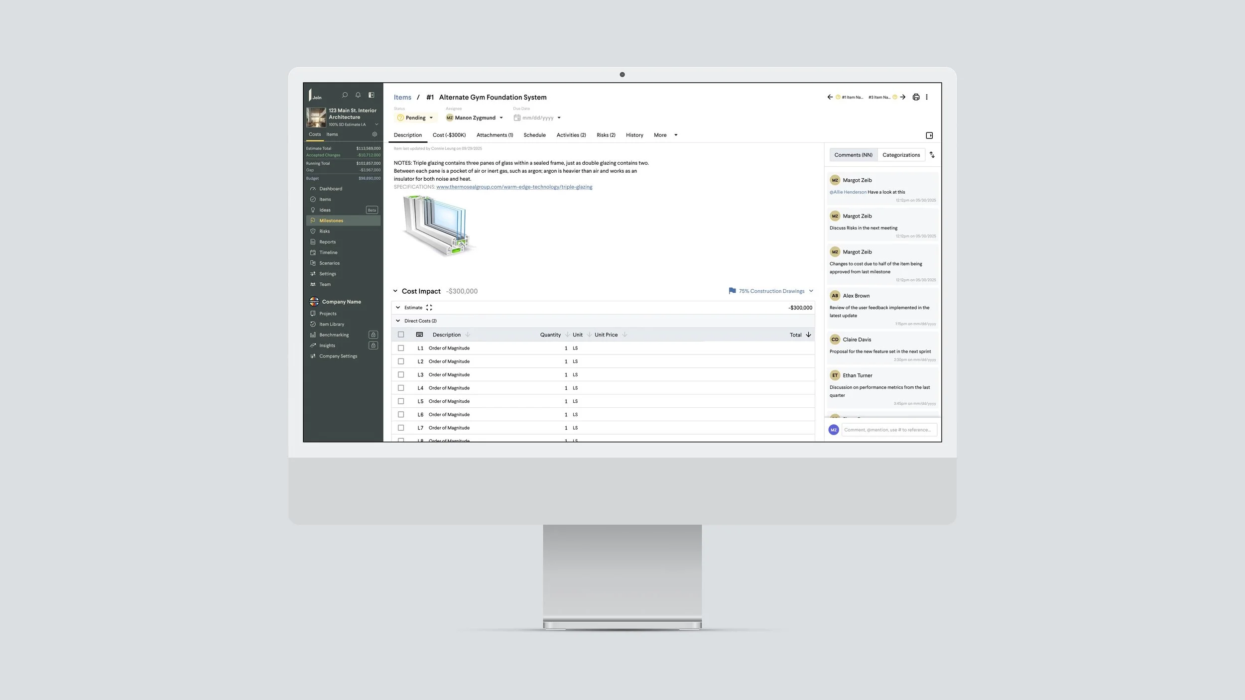
Item Details acts both as a editable space for General Contractors to keep track of changes to design and a place for discussion with stakeholders.
A few visual cleanups on a highly visible page opened the door to something bigger: resolving friction points that had been on the product team's radar for some time.
From there, we identified business and user problems to solve and the metrics to measure them against.
Overview
Business Problem
Item Details is one of the app's most visited pages, but the experience hadn't kept pace with the rest of the product.
We aligned on four goals heading into the redesign:
Simplify navigation and reduce friction
Establish clearer hierarchy around the most important data
Surface app features that intersect with Item Details
Build a scalable foundation that accommodates future growth
User Problem
For project teams, comments are how action items get assigned and decisions get made. Users were finding them hard to navigate, creating friction at a crucial point in the workflow.
A key constraint: long-time users had built muscle memory around the old navigation. The redesign had to feel intuitive to them from day one.
Comment activity: tracking upticks in usage
Due dates added to Items
Descriptions filled in by user
Photos added within descriptions
Proposed Metrics Once Launched
Feedback & Results
Internal response was strong. Colleagues noted the page felt significantly more polished and easier to move through.
In external user feedback, participants predicted that new users would onboard more easily, surfaced metrics would prompt teams to fill in key project details, and elevating comments to a more prominent position was a unanimous win.
Research & Insights
I led the research end-to-end: partnering with the PM to recruit the highest-engagement users from the past six months, preparing prototypes, and building a structured interview framework to keep feedback consistent across sessions.
Methodology
The sessions were deliberately open-ended. I let users explore an interactive prototype without much context first, listening for unprompted reactions. Where something caught their attention, we probed further, testing whether our hypotheses held or needed rethinking.
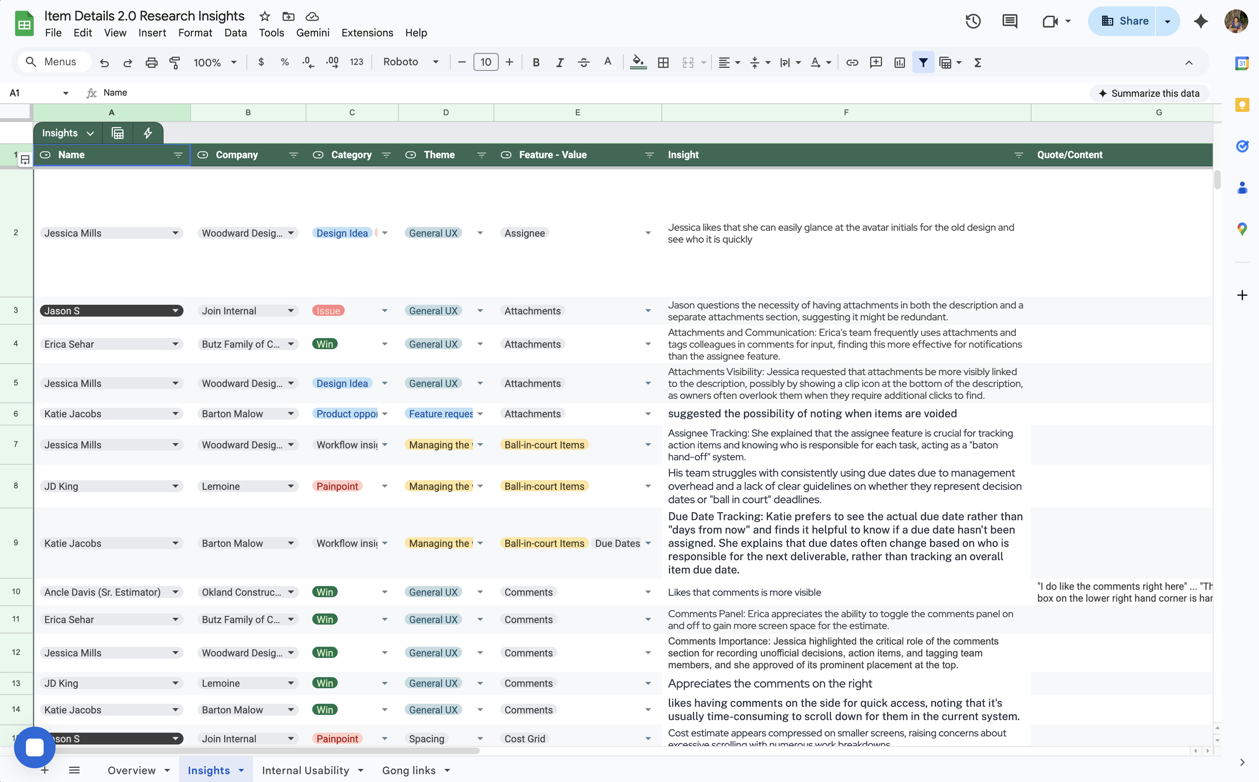
Re-watching the recordings, and with the help of AI tools, I cataloged key insights and labeled them into themes for easier access and organization.
Key Insights
The interviews did two things: they revealed where user expectations diverged from our assumptions, prompting real design adjustments, and they validated the hypotheses we'd been less certain about.
Insight #1: User research validated designs for the comments section
Before
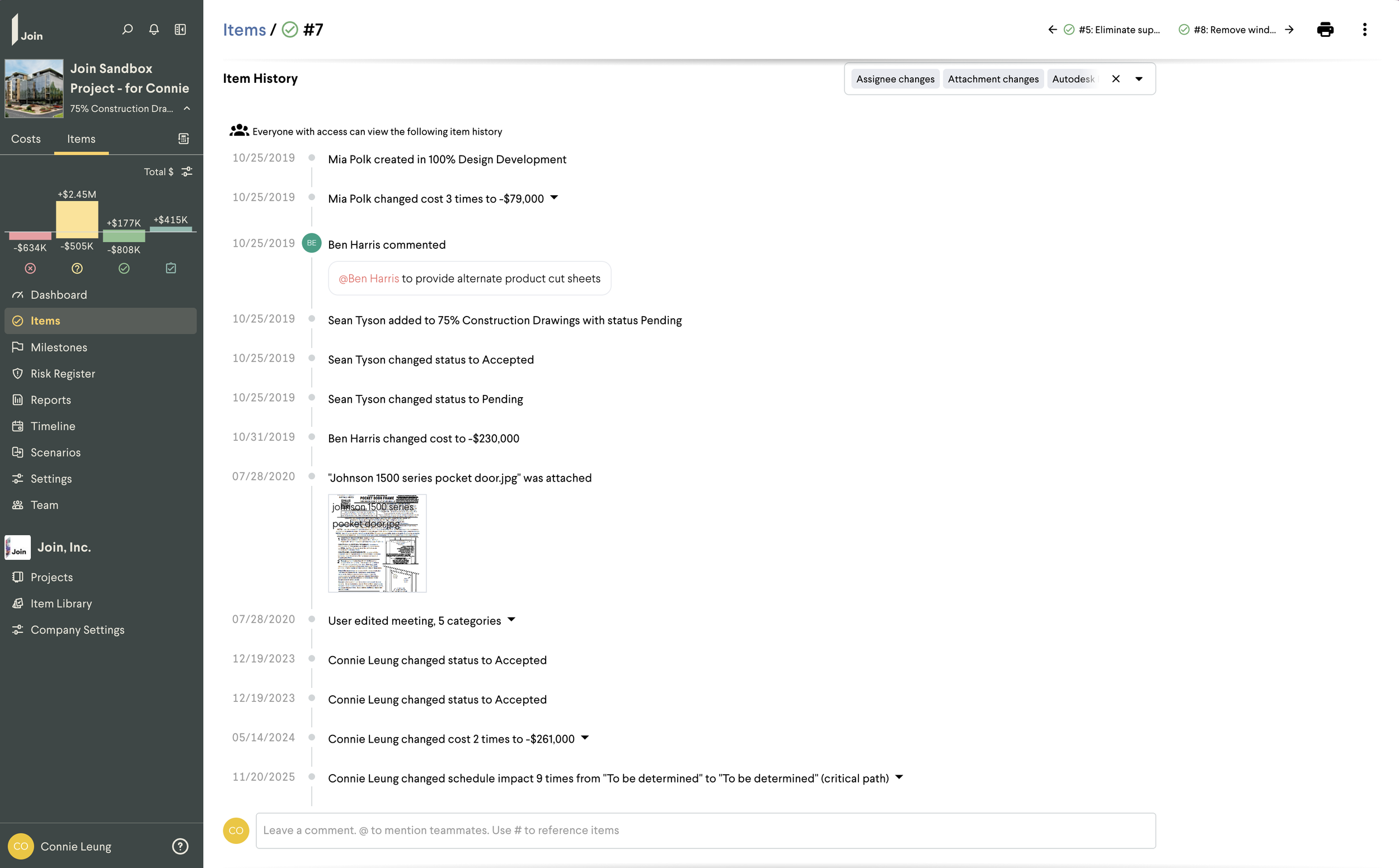
Comments were buried & lost among history details and only visible after scrolling to the bottom.
Screen recordings showed users physically tracing them with their cursor just to follow the thread.
After
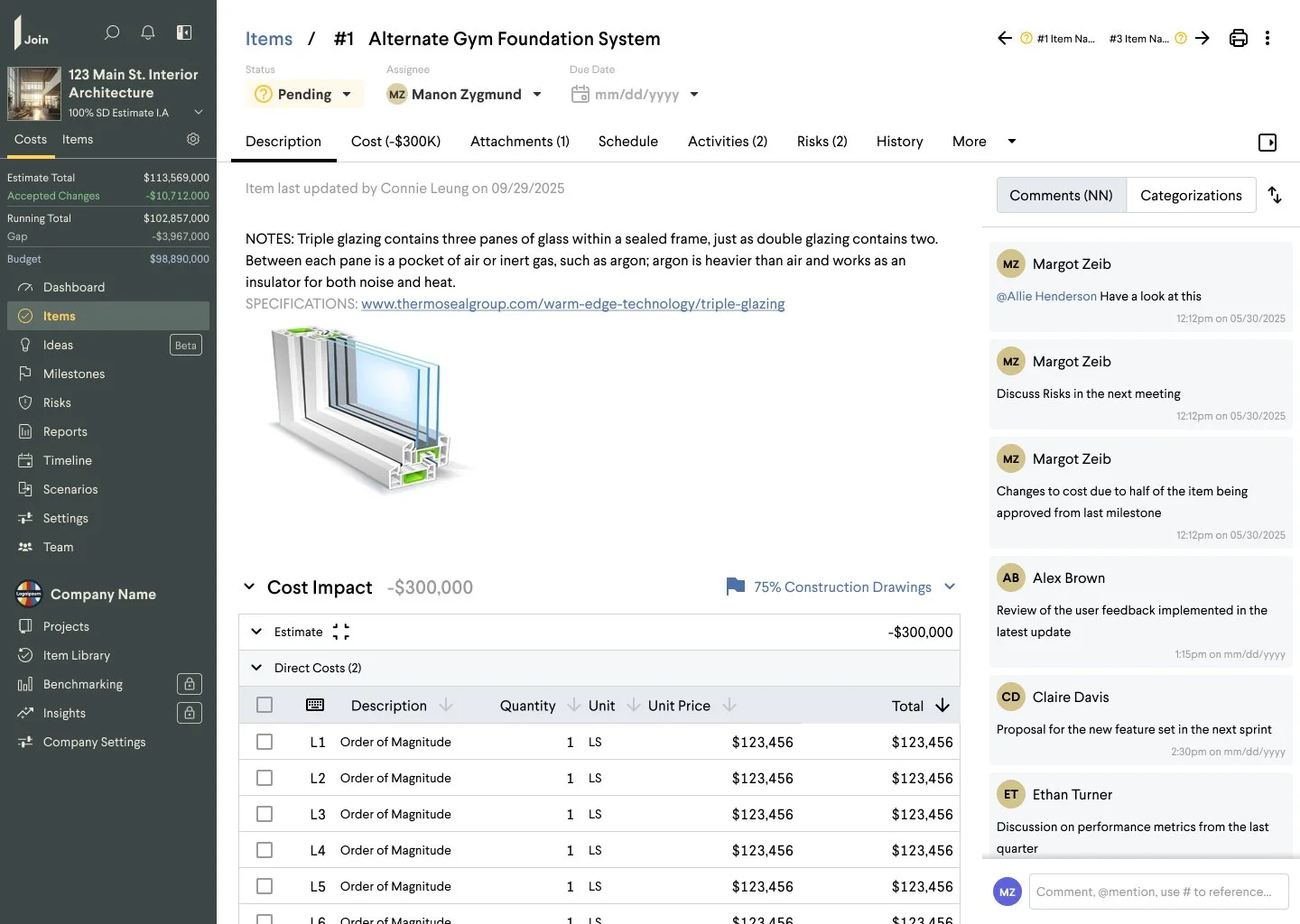
Elevating comments to a more prominent position on the page was unanimously well-received, confirming the initial direction.
Adding a new comment is now immediately obvious, and the design creates room for future iterations: filtering, replies, and threading, without requiring a structural rethink.
Side by Side Before and After
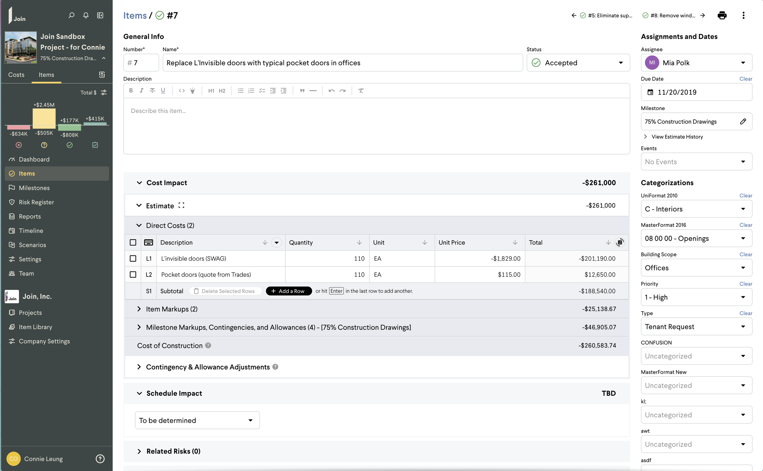
Before: Comments are hard to read and at the bottom of the content.
After: Comments are layered on top and more integrated with the context
Insight #2: Research shaped my approach to navigation interactions.
Before
While some hierarchy existed, the sheer number of inputs shown at once made the page difficult to parse.
Users had to actively focus on one area while mentally filtering out the rest. Frequently-edited fields like "Assignee” were in the same location as fields set once, like "Categorization."
Navigation was scroll-and-hope: users had to learn the page through repetition rather than being guided by the design.
After
A clearer structure lets users jump directly to what they need or scroll naturally through the page, an interaction pattern that felt lighter and less effortful in testing.
The layout also establishes a scalable foundation that accommodates future additions without disrupting the overall hierarchy.
Side by Side Before and After
Before: No ability for quick scanning and no guidance. Users had to know the page to use the page.
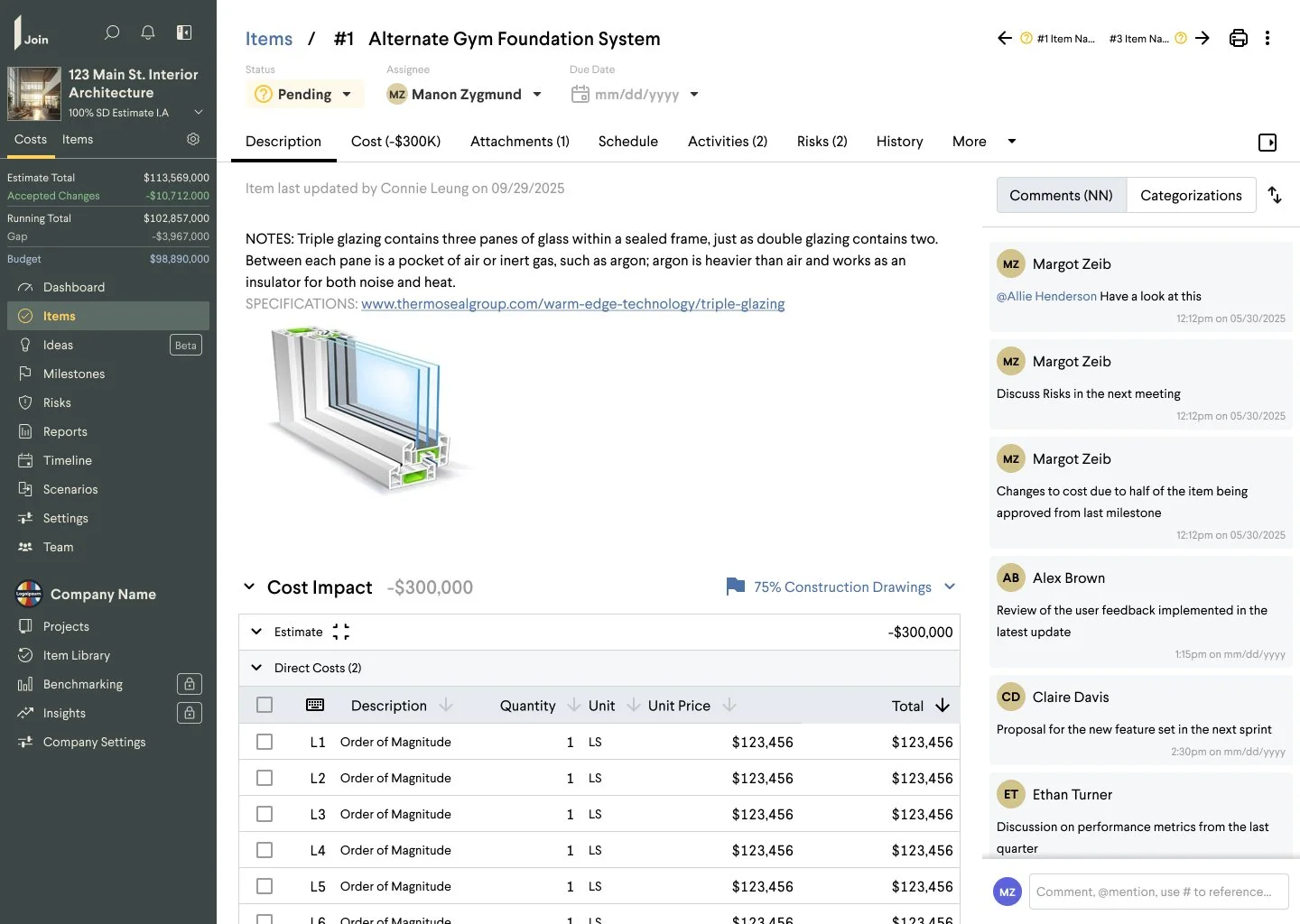
After: Key information front and center. Tabbed navigation for everything else.
In their own words
Customer Feedback

"it is nice to have the comment[s] here. It can be frustrating…to get all the way down [to] that on the page."
Sr. Precon Manager
"It's super easy. It's really intuitive. Our clients like that. They can go in and see it. Our design team generally is pretty quick to like get on board with it."
Sr. Precon Manager
...first [thing I notice] is the comments on the right side instead of being in the bottom of the item window. That's good. We've been trying to push our teams to use the comments more in updating and asking questions as well..."
VP of Precon