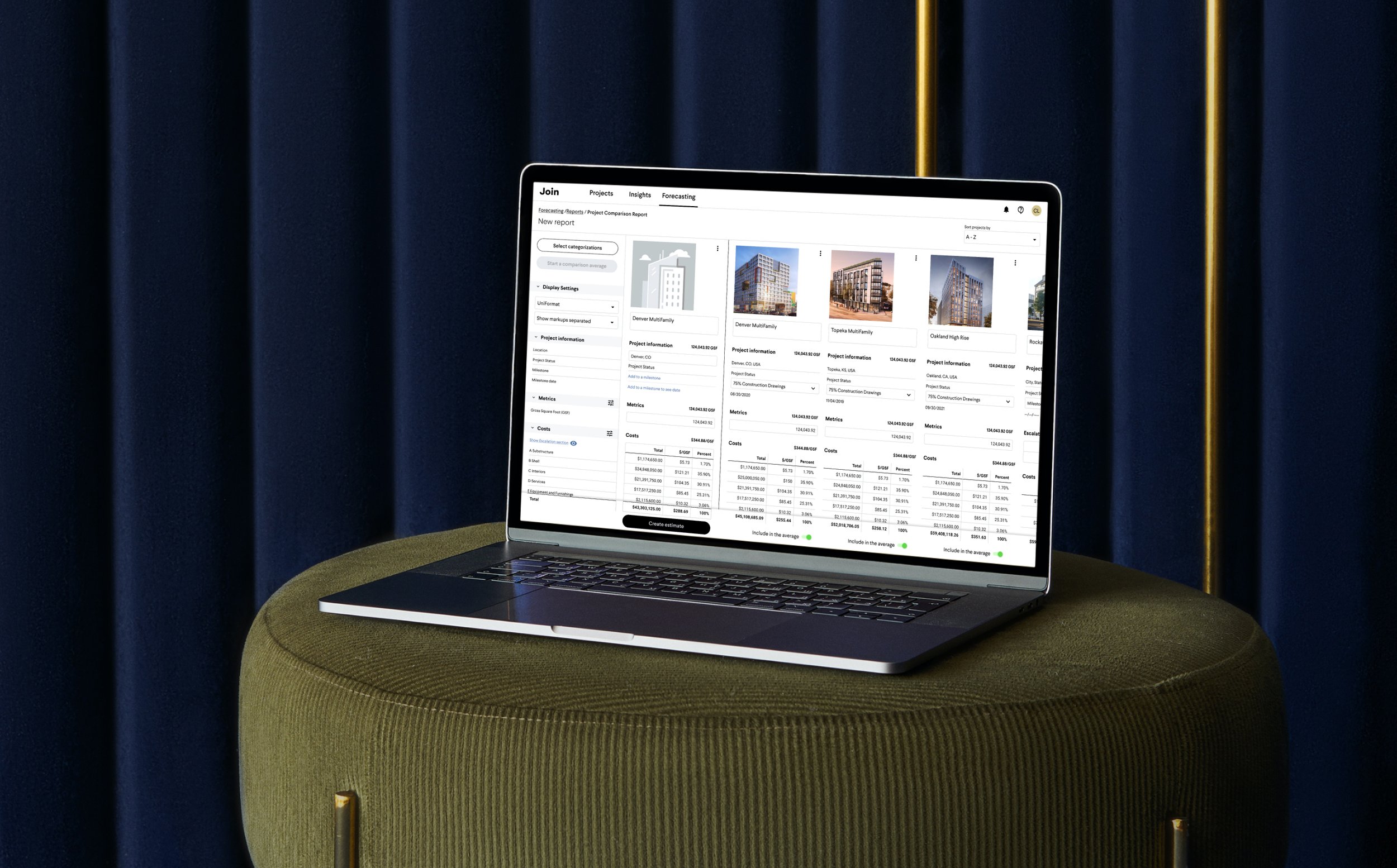
Project Comparisons / Benchmarking
Join - Desktop Web App - Pre Construction Management B2B SAAS
Role
UX designer
Scope
Concept to Launch
Design Maintenance
Design Feature Add-ons
Team
Lead: Drew Wolpert
Product Team Designers: Therese Hom
Product Manager: Raenelle Love
Engineers: Mark Deutsch, Kristina Kosina, Kevin Rakestraw, Jaryd Carolin
Timeline
Feb 2022 – August 2022
(Concept to Launch)
August 2022 – 2023
(Feature Add-ons)
User Problem
Pre-construction estimating is slow, expertise-heavy work.
Accurate project estimates demand years of accumulated knowledge (often not documented).
Understanding how material costs shift by region, season, or supply chain disruptions.
The data to back it up is often scattered across files and systems.
Defending that accuracy to a client and standing out amidst competition is hard.
Product Opportunity
General contractors were already uploading detailed cost data into our product to track budget changes and create transparency across stakeholders: pre-construction teams, architects, and building owners. That historical data was sitting there, largely untapped.
Results
By surfacing it through a new feature, Project Comparisons, later renamed Benchmarking, we gave estimators a way to reference real historical cost data from comparable projects, dramatically reducing the guesswork and time involved in early-stage estimates.
For our users, this meant putting together an estimate now took hours instead of an average of a week, decreasing their workload by 80-90%
Internally, the feature became a significant revenue driver and a key factor in winning new enterprise clients.
Metrics & Feedback
We looked at adoption rates especially as we added features. At its height during the Benchmarking-focused sales run, the tool had a ~75% adoption rate of our existing users.
Project Comparisons consistently earns unsolicited praise from clients, who say it looks impressive enough to present directly to executives and owners, a meaningful bar in an industry not known for elegant software.
The Design Process
Evaluating the Market Landscape
We audited the tools users were already relying on for comparisons, identifying what worked, and where the experience fell short.
What has worked for our users
Columnal layouts make comparing data side-by-side easy
Creating in excel allows a user to show data exactly how they want
What hasn’t worked for our users
Users have to import files locally, the data isn’t shared across teams.
Presentation-wise, it isn’t polished enough to present right out the box, users often export data to reformat. This is a tedious process.
Owners often don’t have access to the specific files or software, they need to rely on their GC wholly for that data.
Normalizing cost data is a manual process that requires equation inputs every single time.
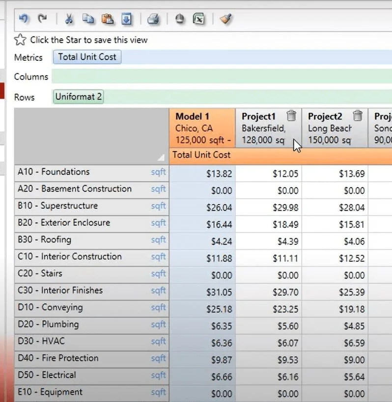
Modelogix is widely used by GCs for Project Comparisons, but the experience shows its age. Its' outdated interface and unintuitive controls make it difficult to present confidently to clients.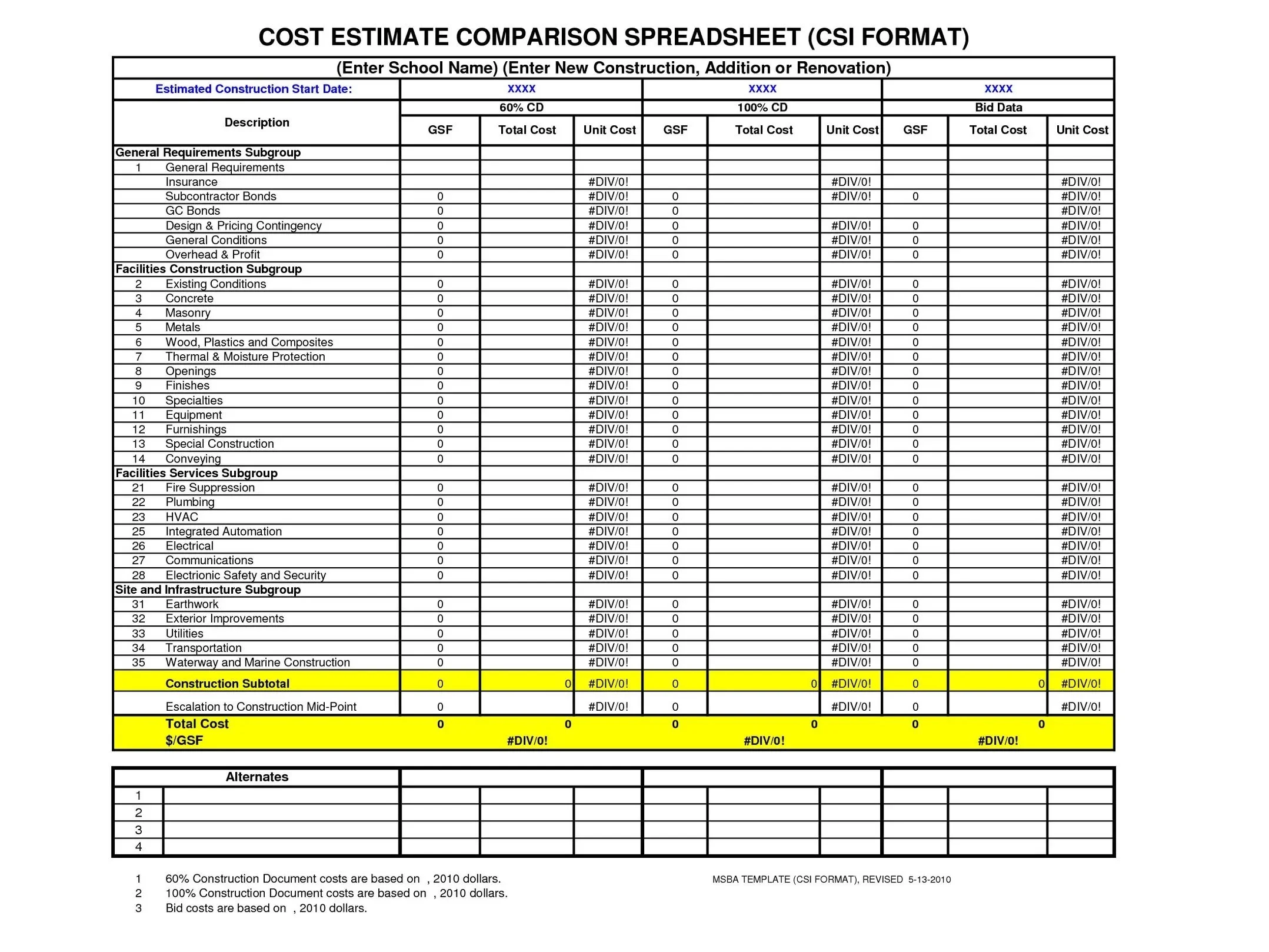
A sample Project Comparison layout built in Excel, simple, but requires an estimator to walk an owner through the data in person.Early Design Explorations: Selected Concepts
Early product requirements gave us room to explore and we came in with a clear picture of what the experience needed to support:
Add any existing Join project to the Comparison Tool, no re-uploading required
View project photos alongside cost data for better visual presentation
Compare data across projects in a columnar layout for easy scanning
Align categorization across projects for an apples-to-apples comparison
Generate an average across selected projects
Build an estimate directly from that average
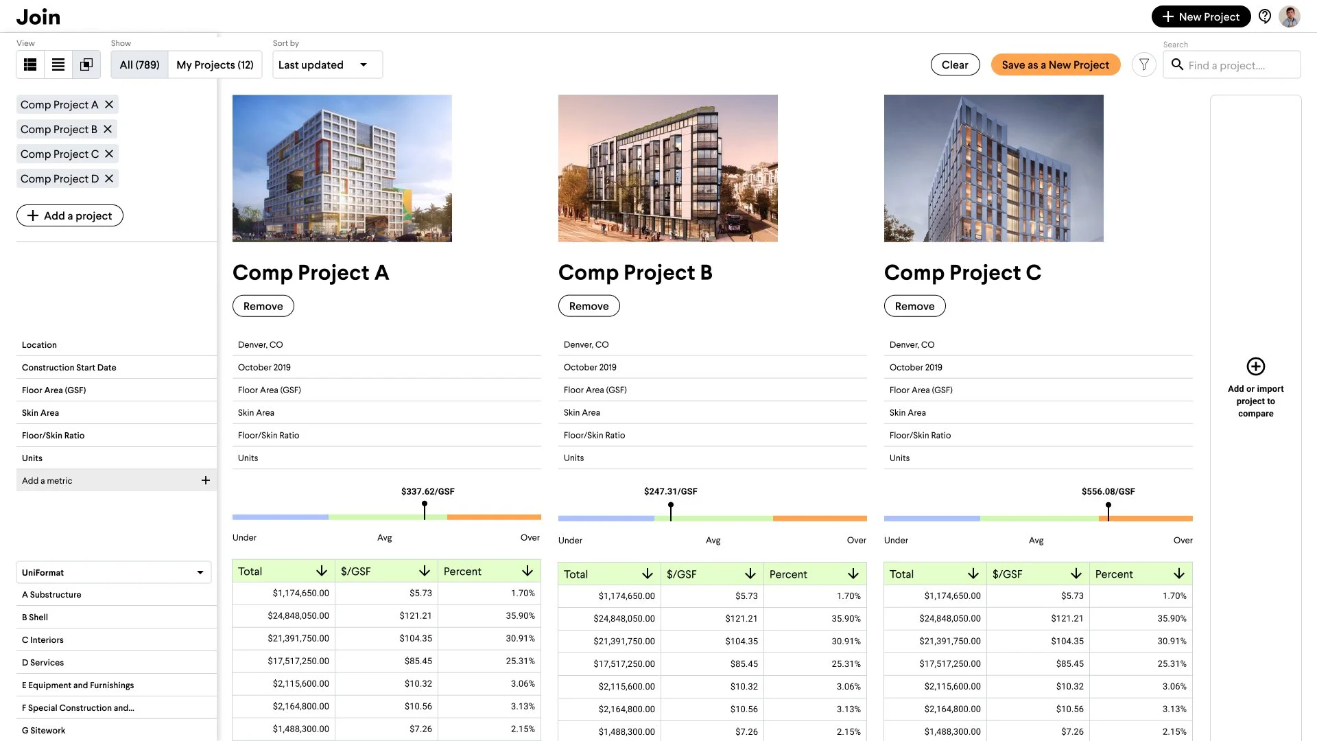
An early concept, later refined, showing a marker to track individual projects against the group average.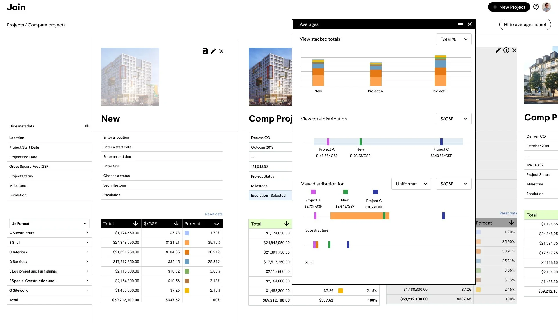
Another early direction that made the average the focal point, surfacing breakdowns visually rather than leaving them for users to initiate the workflow.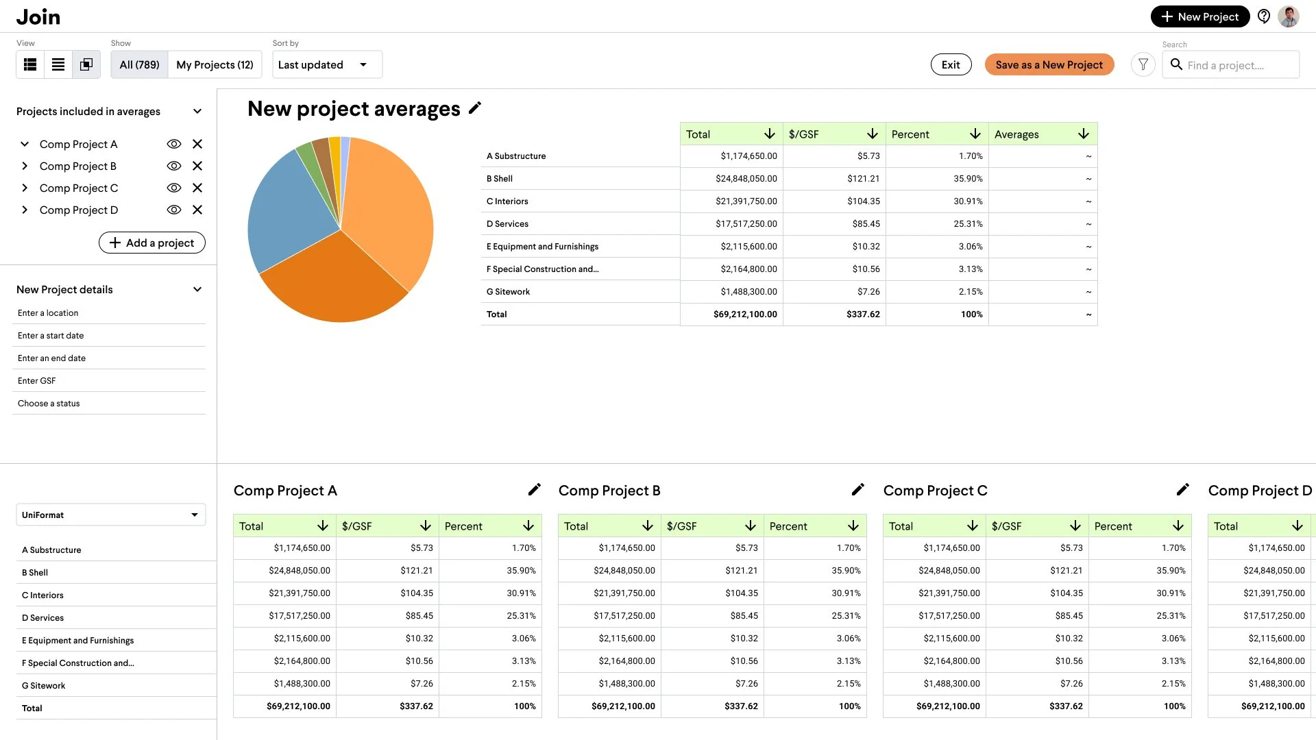
A more refined direction: split panels let users actively manipulate the inputs that define their average, putting more control in their hands.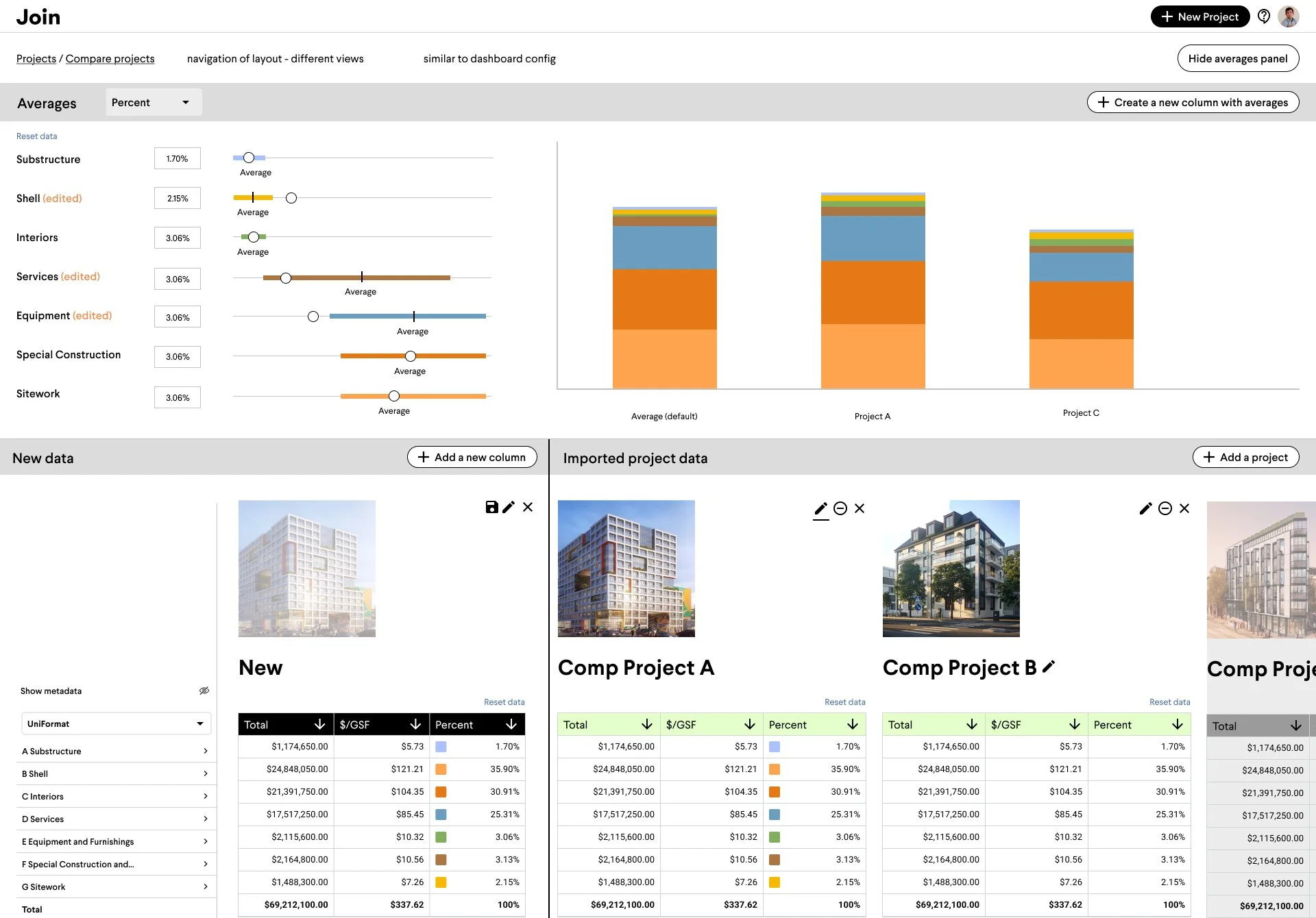
Later-stage concept: a panel view using graphics to measure individual projects against the average.The Final Direction
Our internal customer success team (former GCs and our closest proxy to real users) helped us pressure-test concepts through multiple rounds of feedback before landing on the final direction.
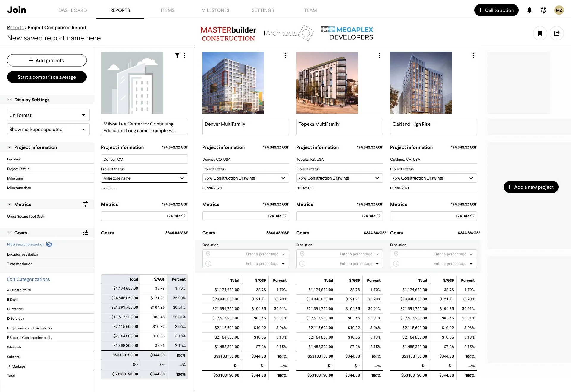
A deliberate MVP: charting and some calculations were scoped out for launch, but the core experience was enough to prove the concept and set the stage for future iterations.Follow-up Iterations
The response to the product was good, and we knew what we needed to add to make the product even better. Adding follow-up features was always part of the plan.
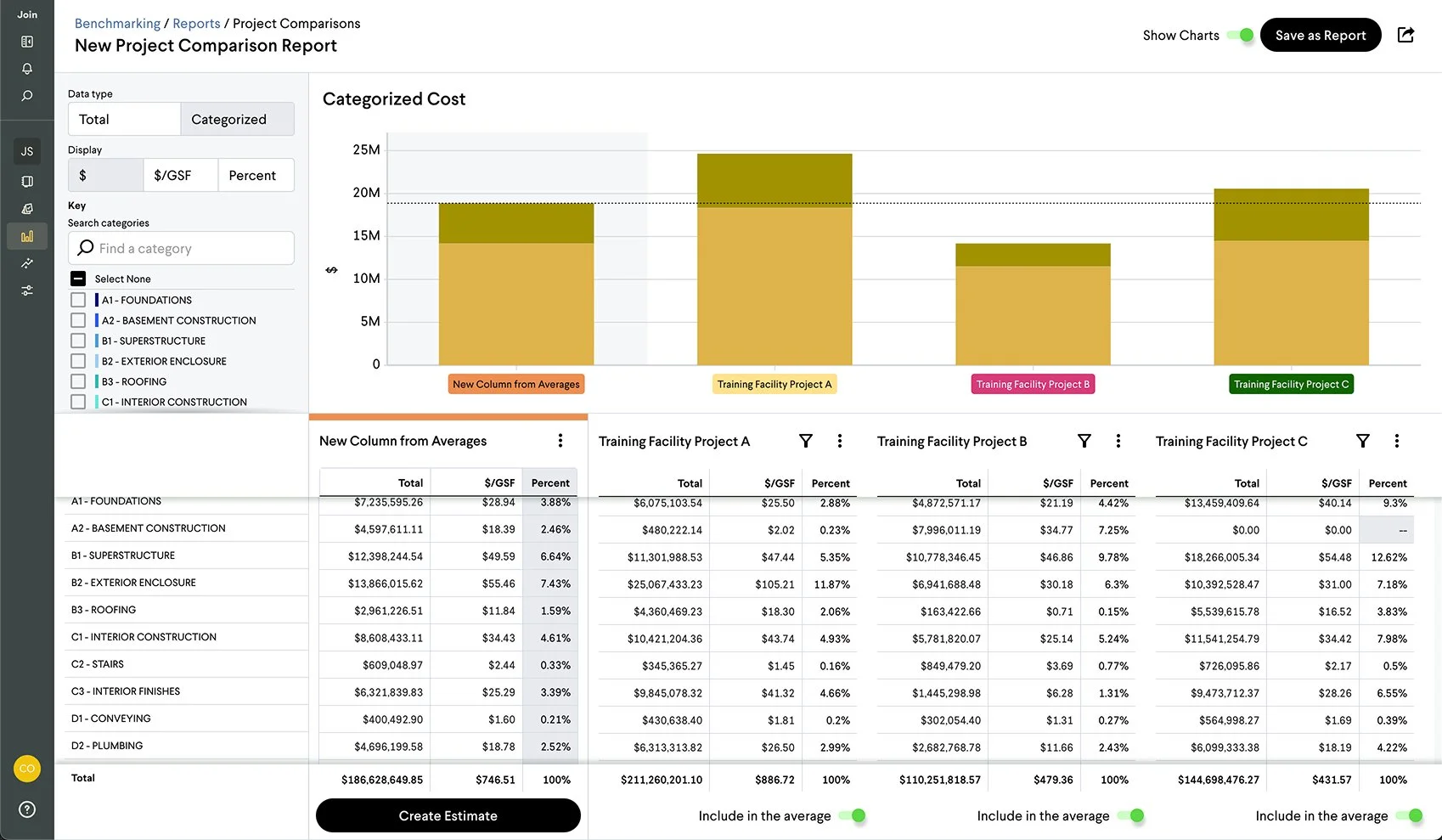
Subsequent iterations introduced charting with configurable data: giving users a visual layer to surface what mattered most to them.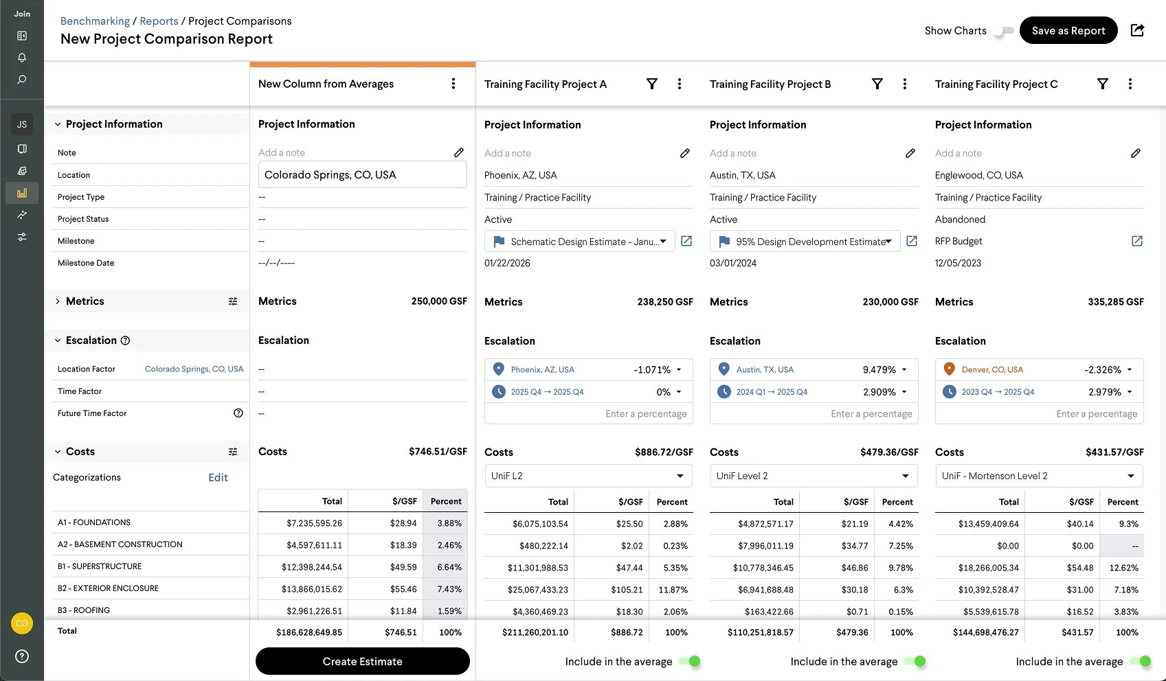
A partnership with RSMeans, the industry-standard source for time and location cost factors, allowed us to automate escalation and normalization, removing a significant manual burden from estimators.In Their Own Words
Sales Team & Customer Feedback

“It was so smooth implementing benchmarking. The week that we imported our data, an estimator came to me Friday afternoon and said “I have a presentation for an assisted living owner on Monday, can you help me put together a presentation?” I said “oh boy, have I got the tool for you.” After fifteen minutes, he had the deliverable he needed for Monday. We could have done it as accurately as the old way in excel, but there’s no way we could have done it as sexy or as quickly.
”

“...the Precon Manager loves Join Project and is especially attracted to Join Benchmarking. The President knows what Join brings to their customers and their business. Everyone at [Company Redacted] is keen on the notion that deploying Join is fast and non-disruptive….High Impact…..No Baggage
”

“...they chose to go with an enterprise agreement. It just made more sense than project specific, especially with Benchmarking.
”

“That’s one sexy tool we have access to!!
”